
Horse Volume Pivot

Horse Volume Pivot
Take your trading to the next level with Horse Volume Pivot. Our powerful tool provides actionable insights, helping you:
- Identify key support and resistance levels.
- Anticipate potential price reversals.
- Understand market sentiment and momentum.
- Optimize your entry and exit strategies.
Volume
Bull and bear are old days, Bifurcation was the need to beat the old trading system where most of the traders had made losses. Now we have a Horse it represents that is higher than a bull and Donkey its lower than a bear.
The ability to make considered decisions or come to sensible conclusions based on buy sell percentage ratio. Shows the total buy and sell volume, based on the high buying power it shows as a horse and high selling its donkey. For mid-level, it's Bull & Bear.
Pivot Trend (Pivot Pyramid Theory)
The Pivot Pyramid Theory introduces a unique perspective on trend analysis. It envisions three key levels: Earth, Sky, and Heaven. These levels represent dynamic support and resistance zones that can shift as the market evolves.
**Operator Up Button:**
- Earth, Sky, Heaven: When the trendlines are aligned in this order, it indicates a bullish trend. The Earth level acts as strong support, while the Heaven level serves as significant resistance. The Sky level often acts as a potential resistance or a retest point before the price moves higher.
**Operator Down Button:**
- Heaven, Sky, Earth: When the trendlines are reversed, with Heaven below Earth, it signals a bearish trend. The Heaven level becomes a strong resistance level, while Earth acts as strong support. The Sky level can act as a potential support or retest point before the price declines further.
The Earth-Sky-Heaven Alignment strategy (also known as "Riding the Horse Wave") is useful across all timeframes, it is best utilized and evaluated on second timeframes, especially 5-10 or 30-second charts.
Pivot Zone
It's the horizontal section stretching from left to right that divides buy and sell layouts by zone. When the price "breaks" through a pivot level (support or resistance), it suggests that the market is shifting. A break above a resistance pivot could indicate bullish momentum, while a break below a support pivot might indicate bearish momentum. Pivot Zone can signal a change in market sentiment and often leads to the stock's price either moving further in the direction of the breakout or possibly reversing direction.
Pivot Zone Background color, highlighting.
Buy = (Blue Zone) Sell = (Orange Zone)
PivFib (Pivot Fibonacci or Pivot Five)
It's the vertical section stretching from down to up with 3 Inside Pivot Lines based on a 25%, 50% & 75% rule to classify 4 Inside Trend. It refers to identifying key levels (support and resistance) inside the pivot calculated from the recent swing high and low dynamically. This technique is used to anticipate possible price reversals or trend continuation.
Internal Pivot Breaks (IPB)
An "internal pivot" can refer to a short-term support or resistance level that is within a broader trend or pivot zone. These could be levels formed by smaller price swings within a larger pivot. Internal pivot breaks are often used as early warning signals for change in direction or continuation.
Label as IPBU (Up) and IPBD (Down)
Pivot Zebra lines (Price Action)
Pivot Zebra lines are calculated for different swings at various levels and in continuation-extended. These lines are colored green-yellow for bullish and black-yellow for bearish.
Longer lines indicate higher liquidity on breakout. When the price reaches these levels, it may experience increased volatility and potential price reversals.
Candlestick Patterns, Colors Highlighting
For improved trading setup identification, I've added clean visual cues (colors and symbols) to highlight key candles on the chart.
Among the high-probability candles I track, two very important candles are particularly noteworthy: the Blue gap up candle (Highest Buying Pressure) and the Black gap down candle (Highest Selling Pressure). (
Rsi Candle
When a candle moves outside the Bollinger Bands, its RSI value is displayed on the candle with a background.
Big Candle (Indication of Strong Momentum)
A big candle often signals strong momentum in the market. When you see a big bullish candle, it indicates that buyers were in control during that period. Conversely, a big bearish candle signals that sellers were dominant. These candles are highlighted with lime (bullish) and pink (bearish) colors and labeled as "BC."
Most Important Moving Averages based on priority order
Multi-Timeframe-VWAP refers to the calculation of Volume-Weighted Average Price (VWAP) over different time intervals, such as daily, weekly, monthly, quarter and year. By analyzing VWAP across multiple timeframes, traders can gain a more comprehensive understanding of market trends and potential trading opportunities.
VHLC (Volume-Weighted Highest, Lowest, Close) is a technical analysis concept often used to assess price action, factoring in volume at different price levels. It combines volume with price data to create a more accurate reflection of how the market is behaving. Useful in scalping strategy.
200 SMA is a critical tool for identifying long-term trends and potential support/resistance levels.
To understand long-term market dynamics, I've incorporated multi-timeframe analysis like EMA, SEMA, SMA, RSI, ADX, and SAR, across daily, weekly, and monthly timeframes
VWAP YQM (Yearly, Quarterly, Monthly) Convergence Breakout
To filter false signals and prioritize YQM trend continuation, breakouts are confirmed only after price breaks the relevant pivot level. First bullish breakouts near the YQM convergence are highlighted in yellow, with subsequent bullish breakouts turning green. For downtrend First bearish breakouts are highlighted in black, with subsequent bearish breakouts turning red.
Advanced Technical Analysis
Experience a new level of trading excellence with the Horse Volume Pivot indicator. Its innovative approach of clear picture.
Benefit from a suite of cutting-edge tools, including Pivot Zones, PivFib, Internal Pivot Breaks, and more.
By harnessing the power of "Horse Volume Pivot" alerts, you can streamline your trading workflow, improve decision-making, and ultimately enhance your trading performance.
Create Alert Strategies based on different timeframes to maximize trade win & profit probability.
Automate your trading process, reducing impulsive decisions. Receive real-time alerts for potential entry and exit signals. Never miss a profitable trade with timely notifications.
Stay ahead of the market with new VWAP YQM Convergence Alerts. This feature notifies you of a rare but highly significant event when yearly, quarterly, and monthly VWAPs meet at a common price. This indicates that traders across multiple timeframes agree on a key price, creating a highly significant support/resistance level. A break of this level often leads to a continuation of the prevailing trend, providing high-probability trading opportunities.
* Dynamic CPR (DCPR) and the Pivot Pyramid: A Layered Approach to Trend Identification
The Dynamic CPR (DCPR) recalculates levels continuously as new price data emerges, adapting to real-time price action. This dynamic nature provides a more accurate reflection of the current market state.
The DCPR Pivot Pyramid organizes these dynamic levels into a layered trend structure, offering a more nuanced perspective than simple bullish or bearish classifications. Relying solely on basic trend identification can often lead to losing trades. The DCPR Pyramid delves deeper, revealing micro-trend details and significantly improving trade entry decisions.
The DCPR Pyramid is divided into five distinct trend layers:
- Blue (Horse Trend): Represents a strong, extreme upward trend.
- Green (Bull Trend): Indicates a moderate upward trend.
- Gray (Neutral/Hunting Zone): Represents a zone of indecision, typically situated near the extreme (Horse) trends. This area is characterized by potential stop-loss hunting behavior, where price may briefly move against the prevailing trend before either resuming the extreme trend or reversing into a bearish trend.
- Pink (Bear Trend): Represents a developing downtrend and acts as a risk management signal in uptrends. During a downtrend, even if price rallies while the Pink layer is present, avoid counter-trend long (buy) positions, as the prevailing downward momentum suggests a high probability of further decline toward the Donkey Trend.
- Black (Donkey Trend): Represents a strong, extreme downward trend.
By understanding these five layers, traders can gain a more comprehensive view of market dynamics, avoid false signals, and make more informed trading decisions.
* Multi-Timeframe DCPR Trend Dashboard
Navigate complex market trends with ease using this innovative tool, providing a holistic view of DCPR trends across multiple timeframes.
Key components:
- Heaven: Represents the highest point of recent price action.
- Pyramid Trend: Visually indicates the active trend.
- DCPR Earth: Serves as a crucial dynamic center point and a key support/resistance level.
Price trading above DCPR Earth suggests positive sentiment, while a move below suggests a potential downtrend.
By combining these elements, the dashboard empowers traders to make more informed decisions and enhance their overall trading strategy.
$60 / Lifetime
Rs: 4567
Horse Breakout Stations
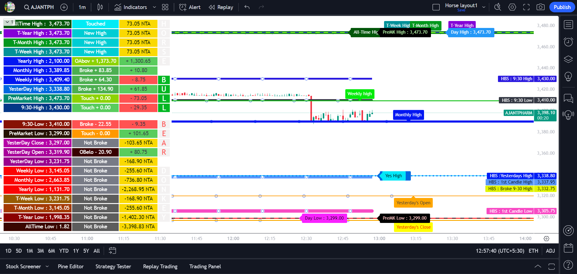
Every single stock has a journey. It travels frequently and creates stations known as breakout levels. Just like a traveler navigating a journey, every stock moves through phases, establishing significant price levels. These levels, often referred to as breakout points, function as support and resistance zones. By understanding the current position of the stock relative to these levels and anticipating its future trajectory, traders can optimize their entry, exit, and holding strategies.
Understand what level the stock is at and where it is heading.
Horse Breakout Stations categorize these key points into four categories:
- Bull and Horse Stations: Represent significant highs, such as yesterday's high, weekly high, and yearly high.
- Bear and Donkey Stations: Indicate significant lows, like yesterday's low, weekly low, and yearly low.
Horse Breakout Stationsl Levels show all periodic levels. Some clear explanations of the levels for understanding can be found below. (1st column)
- Yearly High, Monthly High, Weekly High: The high is calculated for the PAST, year, month and week (Consistent breakouts of Past highs can indicate a strong uptrend.)
- T-Year High, T-Month High, T-Week High: T stands for "this" current year, month and week (Once the stock reaches this weakest level, it becomes no trading zone, (Sideways) suggesting a lack of clear upward or downward momentum. Trading activity is discouraged for the day.)
- Pre Market High & Low: Are dynamically updated based on the session and displayed on the chart.
- 9:30 Trend High & Low: This is the 9:30 candle on the basis of which the high-low level is created and displayed on the chart.
Interpreting Station Status (2nd column)
The dashboard provides station status information. Key abbreviations used are- Not Broke: The station has not been breached.
- Broke +78: The station was broken, and the price surged by 78 points.
- Broke -76: The station was broken, and the price declined by 76 points.
- OAbov stands for Opened Above
- OBelo stands for Opened Below
- YD Broke stands for Yesterday Broke
- Below satisfies that it is below the closing price
- New High: means that the level has been updated with the current new High reached today. (Applies to T-Yearly, T-Monthly, T-Weekly and All-time)
The third column quantifies the price movement of each station relative to the closing price (3rd column)
- NTA (Need to Achieve): The level is yet to be reached. (highlighted in yellow)
- Positive green are rising values
- Negative red are falling values
9:30 candle level
- This station represents the high and low of the first 15 minutes of the trading session. A broken 9:15 high is often a significant bullish signal. When the 9:15 high is broken on the chart, a yellow stepline is displayed above the candles indicating it's the session 9:30 high for the day.
Interpreting Station Signals (4th column)
- The dashboard's fourth column uses color-coding to visually represent the strength of each station: Horse (strong bullish) Blue, Bull (bullish) Green, Bear (bearish) Red, Donkey (strong bearish) Pink, and Neutral (indeterminate) Gray.
- When the stock price trades within the first candle's high and low, it often exhibits sideways, unidirectional movement. This range typically lacks strong directional bias, increasing the risk of potential losses. Trading within this range is generally discouraged.
- Caution: Gray stations are high-risk no-trade zones. Entering this station often leads to losses. (100%)
Discover Market Clarity with the Enhanced Horse Breakout Stations. Featuring customizable dashboards that display market data relevant to your trading strategy. Visually appealing and efficiently organized labels enable effortless identification of station levels, empowering you to enhance your market analysis and make more informed trading decisions.
$60 / Lifetime
Rs: 4567
Horse's All In One Probability
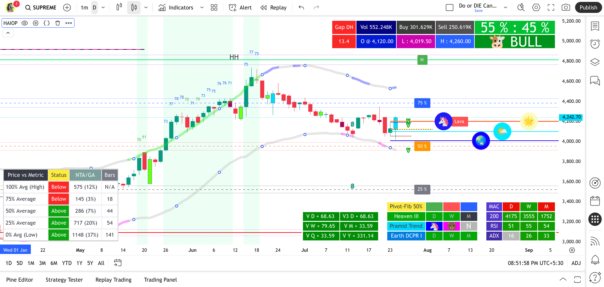
Horse's All In One Probability
Trading System Backbone Beyond the Signals for High-Probability Analysis
The Horse's All In One Probability Indicator is a cutting-edge, comprehensive trading system engineered to provide traders with a powerful, multi-dimensional view of market dynamics. Leveraging advanced algorithmic analysis across numerous timeframes, it precisely identifies high-probability setups and clarifies market direction, serving as your foundational guide for informed and decisive action.
At its core, the indicator introduces proprietary 'Horse' and 'Donkey' classifications, moving beyond traditional 'Bull' and 'Bear' to denote stronger degrees of buying and selling pressure across its various analytical components. This unique terminology aims to provide a clearer, more decisive signal in dynamic, volatile markets.
Clear Picture
This system combines multiple powerful analytical components in synergy, simplifying complex market information to give you a profound understanding of probable price movements. The result is a distilled, clearer picture of what the market is telling you.
-
Real-time Advanced Volume Analysis Dashboard
Bull/Bear classifications are outdated. To overcome the limitations of traditional trading systems, we introduced a unique bifurcation of Horse & Donkey.
This dedicated dashboard provides a live pulse of market participation, displaying total volume, precise buy and sell volumes, and their respective percentages. Crucially, it translates these volume dynamics into intuitive 'Animal' classifications:
- 🦄 "HORSE" signifies extreme buying pressure (stronger than a bull)
- 🫏 "DONKEY" indicates extreme selling pressure (lower than a bear)
- Bull/Bear: Reserved for mid-level buying and selling activity.
By clearly identifying true market strength, this system empowers you to make more confident and considered trading decisions.
-
Dynamic Adaptive Metric Buffer Channels
Gain valuable insights into price action by defining your own analysis period. Simply choose a start date, and the indicator will dynamically calculate and plot key price levels from that point to the current moment.
- 100% (High): The highest price reached.
- 0% (Low): The lowest price reached.
- 75%, 50%, 25%: Percentage-based averages of the range between the high and low.
Each price action level is complemented by an adjustable buffer zone, designed to act as a boundry area. This gives you an early warning when the price is approaching a key metric or a target. A real-time dashboard shows:
- Current Price Status: Whether the current price is "Above" or "Below" each metric level.
- Price Difference: The net difference (with an optional percentage) between the current price and each level.
- Consecutive Bars: The number of consecutive bars the price has spent relative to each metric level.
-
Pivot Trend (Pivot Pyramid Theory)
Go beyond static levels. This advanced system is built on the proprietary Pivot Pyramid Theory, which introduces a unique perspective on trend analysis. It envisions three dynamic key levels: Earth, Sky, and Heaven. These levels represent adaptive support and resistance zones that continuously shift with market evolution.
Earth-Sky-Heaven Alignments:
- Operator Up (Bullish): A robust bullish signal is identified when the three core 50% levels—designated as Earth, Sky, and Heaven—are aligned in ascending order from lowest to highest. This specific alignment indicates a strong upward trend.
- Operator Down (Bearish): When trendlines reverse to Heaven, Sky, Earth, it signals a bearish trend. Heaven becomes strong resistance, Earth strong support, and Sky a potential retest point before further decline.
The Earth-Sky-Heaven Alignment strategy (also known as "Riding the Horse Wave") is useful across all timeframes, it is best utilized and evaluated on second timeframes, especially 5-10 or 30-second charts.
-
Bollinger Bands: Visualizing DCPR Trends with Animal symbols
The Dynamic CPR (DCPR) recalculates levels continuously as new price data emerges, adapting to real-time price action. This dynamic nature provides a more accurate reflection of the current market state.
The DCPR Pivot Pyramid organizes these dynamic levels into a layered trend structure, offering a more nuanced perspective than simple bullish or bearish classifications. Relying solely on basic trend identification can often lead to losing trades. The DCPR Pyramid delves deeper, revealing micro-trend details and significantly improving trade entry decisions.
The DCPR Pyramid's trend is shown in the Bollinger Bands color, which dynamically changes to active trend based on five trend layers.
- Blue (Horse Trend): Represents a strong, extreme upward trend.
- Green (Bull Trend): Indicates a moderate upward trend.
- Gray (Neutral/Hunting Zone): Represents a zone of indecision, typically situated near the extreme (Horse) trends. This area is characterized by potential stop-loss hunting behavior, where price may briefly move against the prevailing trend before either resuming the extreme trend or reversing into a bearish trend.
- Pink (Bear Trend): Represents a developing downtrend and acts as a risk management signal in uptrends. During a downtrend, even if price rallies while the Pink layer is present, avoid counter-trend long (buy) positions, as the prevailing downward momentum suggests a high probability of further decline toward the Donkey Trend.
- Black (Donkey Trend): Represents a strong, extreme downward trend.
Active trend identification : Is facilitated by Animal symbols in the circle
By understanding these five layers, traders can gain a more comprehensive view of market dynamics, avoid false signals, and make more informed trading decisions.
-
Bollinger Bands RSI Candle:
When a candle moves outside the Bollinger Bands, its RSI value is precisely displayed on the candle itself.
-
Multi-Timeframe DCPR Trend Dashboard
Navigate complex market trends with ease using the Multi-Timeframe DCPR Trend Dashboard. This innovative tool provides a holistic view of DCPR trends across multiple timeframes.
Key components:
- PivFib: Price range from recent swing highs/lows into four internal trends using 25%, 50%, and 75% Fibonacci Colors highlighting.
- Heaven: Represents the highest point of recent price action.
- Pyramid Trend: Visually indicates the active trend.
- DCPR Earth: Serves as a crucial dynamic center point and a key support/resistance level.
Price trading above DCPR Earth suggests positive sentiment, while a move below suggests a potential downtrend.
By combining these elements, the dashboard empowers traders to make more informed decisions and enhance their overall trading strategy.
Pivot Fibonacci (PivFib)
Elevate your strategic advantage with a unique multi-timeframe approach to market analysis. This workhorse combines Fibonacci retracements with a dynamic 25/50/75% pivot rule, providing a profound, color-coded understanding of market momentum. The result is a clear, visual guide to finding market equilibrium and making smarter trades.
PivFib - Classification Logic:
Below 25% (Black):This area represents the lowest range. It could signify a strong bearish trend or an oversold market condition, depending on the context.
Below 50% (Red):This range (from 25% to 50%) suggests a bearish bias, but it's not as extreme as the lowest range. It might indicate a retracement within a bearish trend or a weaker downside momentum.
Above 50% (Green):This zone represents a bullish bias. It could suggest a retracement within a bullish trend or building upside momentum. This area is often considered a "buy" zone for traders looking for confirmation of an upward movement.
Above 75% (Blue):This is the highest range, suggesting a strong bullish trend or an overbought market condition. It indicates significant upside momentum and could be a prime area for profit-taking or confirmation of a strong upward move.
-
Moving Averages based on priority order
Multi-Timeframe-VWAP refers to the calculation of Volume-Weighted Average Price (VWAP) over different time intervals, such as daily, weekly, monthly, quarter and year. By analyzing VWAP across multiple timeframes, traders can gain a more comprehensive understanding of market trends and potential trading opportunities.
VHLC (Volume-Weighted Highest, Lowest, Close) is a technical analysis concept often used to assess price action, factoring in volume at different price levels. It combines volume with price data to create a more accurate reflection of how the market is behaving. Useful in scalping strategy.
-
Long-term Dashboard - Timespan Mastery: The Trader's Edge
MACD: Validating Trend Strength Across Timeframes. Confirm the sustainability of trends by observing MACD Histogram consistency across daily, weekly, and monthly charts, minimizing false signals and maximizing trend-following profits.
200 SMA: Timespan-Adaptive Market Intelligence. Gain a strategic edge with the 200 SMA: decipher short-term sentiment (daily), validate long-term health (weekly), and illuminate generational macro trends (monthly). This empowers data-driven strategies for all investment horizons.
RSI: Pinpoint precise entries and exits by identifying momentum and overbought/oversold levels across all timeframes, maximizing profit potential.
ADX: Confirm trend strength and direction across all timespans to validate setups and optimize portfolios for sustained gains.
Multi-timeframe analysis of RSI and ADX, coupled with MACD and the 200 SMA, delivers a comprehensive view of momentum and trend, empowering confident, data-driven decisions while minimizing risk.
-
VWAP YQM (Yearly, Quarterly, Monthly) Convergence Breakout
To filter false signals and prioritize YQM trend continuation, breakouts are confirmed only after price breaks the relevant pivot level. First bullish breakouts near the YQM convergence are highlighted in yellow, with subsequent bullish breakouts turning green. For downtrend First bearish breakouts are highlighted in black, with subsequent bearish breakouts turning red.
-
Multi-Timeframe Probabilistic Confluence & VWAP Mastery
The core of this system analyzes popular technical tools like RSI, MACD, ADX, 200 SMA, and VWAP across Daily, Weekly, Monthly, Quarterly, and Yearly timeframes. It identifies powerful "confluence probabilities" when these indicators align across multiple horizons, signaling high-conviction buy or sell opportunities. The indicator also provides on-chart labels for key VWAP levels, highlighting critical convergence zones (e.g., when Yearly, Quarterly, and Monthly VWAPs align) and triggering alerts for these pivotal points. The VWAP YQM (Yearly, Quarterly, Monthly) Convergence Breakout feature specifically filters false signals, confirming breakouts only after price breaches the relevant pivot level, with bullish breakouts highlighted in yellow (first) then green (subsequent), and bearish breakouts in black (first) then red (subsequent).
-
Extensive & Intelligent Alerting System with Breakout Confirmation
Receive timely notifications for:
- Crossovers/crossunders of price with VWAP (Daily, Weekly, Monthly, Quarterly, Yearly).
- Crossovers/crossunders of price with 200 SMA (Daily, Weekly, Monthly).
- MACD histogram crosses above/below zero (Daily, Weekly, Monthly).
- Confluence signals when 200 SMA, MACD, RSI, and ADX are all aligned bullish or bearish across Daily, Weekly, and Monthly timeframes.
- DCPR Earth & Lava scalping opportunities on specific minute timeframes (30m, 45m, 60m).
- Price crossing over/under the dynamically calculated "Price Vs Metric" levels and entering their buffer zones.
- DCPR Multi-Level Pivot Breakouts: Confirmed breakouts when a single candle breaches all three "Earth," "Sky," and "Heaven" pivot levels, indicating strong trend continuation.
- Customizable Breakout Counters: Crucially, alerts for pivot and other breakouts are filtered by user-defined consecutive bar counts. This advanced feature validates signal strength, distinguishing genuine trend continuations from noise and significantly reducing false signals, ensuring you focus on high-probability setups.
Why Use This Indicator?
The Horse's All In One Probability Indicator empowers you to:
- Identify high-probability trading setups with increased confidence, leveraging a multi-dimensional approach.
- Gain a holistic, multi-timeframe understanding of market trends, momentum, and volume dynamics.
- Utilize dynamic support and resistance levels, precise candle pattern recognition, and key pivot breaks for sharper entries and exits.
- Confirm signals through the powerful confluence of diverse technical indicators across various timeframes.
- Track price performance against custom, time-bound historical ranges.
- Receive proactive alerts for critical market shifts and high-probability setups.
- Access a robust base or a complete system for your trading strategy, simplifying complex analysis into actionable insights.
Recommended Timeframe for Optimal Performance:
The Daily timeframe is universally recommended for this indicator, consistently providing robust signals for all types of traders. While you may utilize lower timeframes if your strategy specifically demands it, for optimal clarity and performance, your best results will come from consistently sticking to the Daily chart.
- It's crucial to understand how to correctly set up and manage alerts within your trading platform to fully leverage the indicator's features.
- We strongly recommend enabling alerts on your Watchlist to ensure you capture all high-probability setups as they occur.
Take your trading to the next level with Horse Volume Pivot. Our powerful tool provides actionable insights, helping you:
- Identify key support and resistance levels.
- Anticipate potential price reversals.
- Understand market sentiment and momentum.
- Optimize your entry and exit strategies.
Pivot Zebra lines (Price Action)
Pivot Zebra lines are calculated for different swings at various levels and in continuation-extended. These lines are colored green-yellow for bullish and black-yellow for bearish.
Longer lines indicate higher liquidity on breakout. When the price reaches these levels, it may experience increased volatility and potential price reversals.
Candlestick Patterns, Colors Highlighting
For improved trading setup identification, I've added clean visual cues (colors and symbols) to highlight key candles on the chart.
Among the high-probability candles I track, two very important candles are particularly noteworthy: the Blue gap up candle (Highest Buying Pressure) and the Black gap down candle (Highest Selling Pressure). (
Importance of Pivot Breakout Counters:
"The breakout counters are crucial for validating the strength of potential breakout signals. They track the number of consecutive price breaches above the upper band or below the lower band. This consecutive count acts as a filter, distinguishing genuine trend continuations from mere price fluctuations. A higher count signifies stronger momentum and increases the probability of a sustained move in the breakout direction. By requiring a user-defined number of consecutive breakouts before triggering alerts, the script significantly reduces the risk of false signals and enhances the reliability of the generated trade signals. This feature allows traders to focus on high-probability setups and avoid premature entries based on fleeting price action." Harness the power of Customizable Breakout Alerts.
Live Candle Levels :
Visualize Key Price Action. Project the previous candle's open, high, low, close, and midpoint in real-time providing a clear view of potential support and resistance levels for strategic trading decisions.
Note 1 : "It's important to use alerts correctly." Please refer to this YouTube video to understand the concept of creating alerts.
Note 2 : "We strongly recommend enabling alerts on your Watchlist to take full advantage of its features."
Release Notes
Jan 5 2025
Stay ahead of the market with new VWAP YQM Convergence Alerts. This feature notifies you of a rare but highly significant event when yearly, quarterly, and monthly VWAPs meet at a common price. This indicates that traders across multiple timeframes agree on a key price, creating a highly significant support/resistance level. A break of this level often leads to a continuation of the prevailing trend, providing high-probability trading opportunities.
Jan 16 2025
Introducing the DCPR Pivot Pyramid Trend, designed to address the false signals often generated by simple trend lines. Unlike static traditional CPR, Dynamic CPR adapts to real-time price action. With the Pivot Pyramid, DCPR levels are now organized into five distinct trend layers: Horse, Bull, Neutral, Bear, and Donkey. This enhanced layered approach filters out market noise to increase the accuracy of trend identification and inform better trading decisions.
Feb 06 2025
Multi-Timeframe Fibonacci: Precision, Trend Identification, and Equilibrium. This workhorse analysis elevates your strategic advantage. By visualizing the 50% retracement across multiple timeframes, traders identify key points of equilibrium, achieve a broader market perspective, and empower their decision-making with a profound understanding of market dynamics.
"Gain a strategic advantage by implementing alert strategies tailored to various timeframes, utilizing watchlists alerts to identify high-probability trading opportunities and maximize profits."
$60 / Lifetime
Rs: 4567
Horse 12 Stations Aggregated Approach
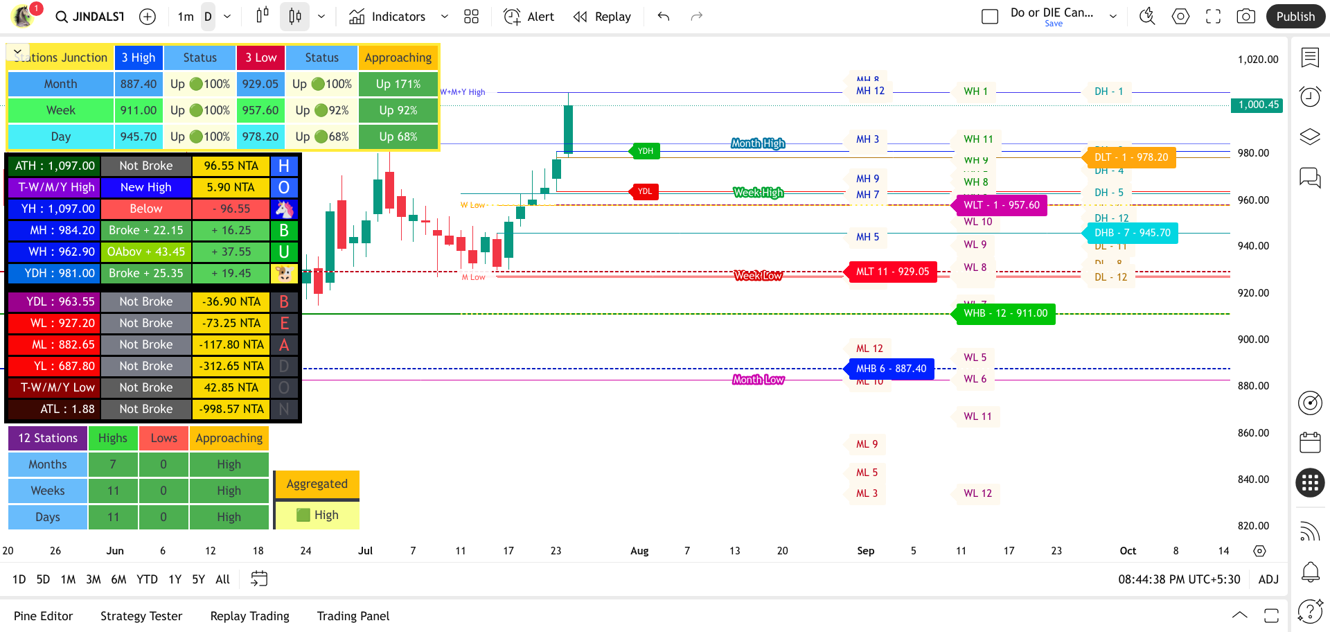
The key to unlocking true trading mastery. Horse 12 Stations Aggregated Approach, a powerful tool that goes beyond common high/low analysis.
Unlock a new dimension of market mastery with the Horse 12 Stations Aggregated Approach indicator. This isn't just another indicator; it's a strategic weapon forged from a distinctive methodology that dissects price action across 12 critical high and low "stations." At its core lies the potent analysis of MLT (Monthly Lowest Top) – the highest low among the last 12 monthly lows, pinpointing hidden long-term support – and MHB (Monthly Highest Bottom), revealing significant monthly resistance. It unveils high-conviction zones where aggregated power can trigger explosive moves. Elevate your trading to an unprecedented level of precision and foresight.
Stations Junction: Navigating Key Price Thresholds
The "Stations Junction" dashboard offers a concise yet powerful lens into the immediate price action relative to critical high and low thresholds identified across the monthly, weekly, and daily timeframes. Think of it as a central point for understanding the ongoing battle between potential support and resistance, derived from the "Horse 12 Stations Aggregated Approach." This dashboard focuses on the most recent significant turning points – the "High Bottoms" and "Low Tops" – to provide traders with a rapid assessment of the current market context and potential short-term biases. By monitoring the price's position and momentum around these levels, traders can gain valuable insights into potential breakouts and reversals.
Clarify "3 High" and "3 Low":
"3 High" Levels: Column labeled "3 High" (Representing the Monthly High Bottom - MHB, Weekly High Bottom - WHB, and Daily High Bottom - DHB)
"3 Low" Levels: Column labeled "3 Low" (Representing the Monthly Low Top - MLT, Weekly Low Top - WLT, and Daily Low Top - DLT)
Percentage to MHB/MLT (or similar key levels): Show the exact percentage distance of the current price specifically to the nearest key station level. This gives a more immediate sense of how close the price is to a potential turning point.
In essence, the "Approaching" column serves two vital roles: first, it indicates the prevailing sentiment within the established "station" range by showing whether the price favors the high or the low. Second, and perhaps more importantly, it provides Breakout Quantification: Once a "station" level is decisively broken, it immediately switches to indicating the direction of the breakout and the percentage of the initial range that the price has extended beyond that broken level. Empowering traders to quickly evaluate the significance of the move.
Visual Clarity and Customizable Focus: The color-coded levels for Monthly, Weekly, and Daily timeframes ensure clarity on your chart. The ability to toggle the display of "All Stations" or just "Key Stations" allows you to tailor the information to your specific trading style and risk appetite.
Alerting System:
The indicator includes a comprehensive alerting system. Users can enable alerts for price crossing both the "Key Stations" and the "sub-stations" for each of the three timeframes. This allows traders to be notified of potential breakout or breakdown events as they occur.
Alright, viewing the Nifty 50 index here in Mumbai, and having set up alerts on my custom watchlist of all 50 Nifty constituents using the "Horse 12 Stations Aggregated Approach" indicator, my alert system would be actively monitoring each stock for breaches of their key Monthly, Weekly, and Daily High Bottom (HB) and Low Top (LT) levels.
Here's how I'd be experiencing those alerts in real-time:
Individual Stock Alerts: As each of the 50 Nifty stocks experiences a price break above its MHB, WHB, or DHB, or falls below its MLT, WLT, or DLT, I would receive a specific alert. This alert would ideally tell me:
- Which stock triggered the alert: For example, "Reliance Industries - Broke above Daily High Bottom." or "Infosys - Fell below Weekly Low Top."
- The timeframe of the broken level: Indicating whether it's a monthly, weekly, or daily key station.
- The direction of the break: Clearly stating "above" or "below."
- Potentially the price level of the break: This would be very useful for confirmation.
Volume of Alerts: Depending on the market activity and the volatility of the individual Nifty stocks, I could receive a flurry of alerts, especially during periods of high volatility or significant market-wide moves. Conversely, during calmer periods, the alerts might be less frequent.
Focus on Key Levels: Because I've likely prioritized "Key Stations" (MHB, MLT, WHB, WLT, DHB, DLT) for my primary alerts, I would be most immediately notified of potential significant trend changes or breakout/breakdown events on these more influential levels.
Filtering Minor Alerts: If I've also enabled alerts for "Minor Stations," I might receive more frequent notifications for smaller, potentially less significant price movements. I would need to manage these alerts based on my trading strategy and risk tolerance.
Example Scenario:
Let's say the Nifty 50 is experiencing a broad bullish morning. I might receive alerts like:
- "ICICI Bank - Broke above Daily High Bottom at ₹1150.50."
- "HDFC Bank - Broke above Weekly High Bottom at ₹1585.20."
- "Tata Consultancy Services - Broke above Monthly High Bottom at ₹4200.00."
These alerts would immediately draw my attention to potential long opportunities in these key Nifty constituents.
Conversely, if there's a sudden bearish downturn, I might see alerts like:
- "State Bank of India - Fell below Daily Low Top at ₹820.10."
- "Axis Bank - Fell below Weekly Low Top at ₹1090.75."
These would signal potential short opportunities or the need to review my long positions.
By setting up these alerts across the entire Nifty 50 watchlist, I aim to leverage the "Horse 12 Stations Aggregated Approach" indicator to proactively identify potential trading opportunities as they emerge within the Indian market's benchmark index.
12-Station Bull/Bear Count
It counts how many times recently the price has been going up past old highs (green numbers).
It counts how many times recently the price has been going down past old lows (red numbers).
Based on these counts, it gives a single overall guess for the short-term: "Up" (green), "Down" (red), or "Neutral" (yellow).
Aggregated Approach:
Shows the short-term bias (Up/Down/Neutral) based on the 12-Station Bull/Bear Count
The "Horse 12 Stations Aggregated Approach" indicator promotes a proactive and informed approach to trading. Its dynamic level identification, customizable alerts, and aggregated bias assessment work together to highlight potential turning points and breakout opportunities, allowing traders to anticipate market movements and strategically plan their entries and exits.
Will add a Video Stay Connected
$60 / Lifetime
Rs: 4567
Horse's VCP Eye View
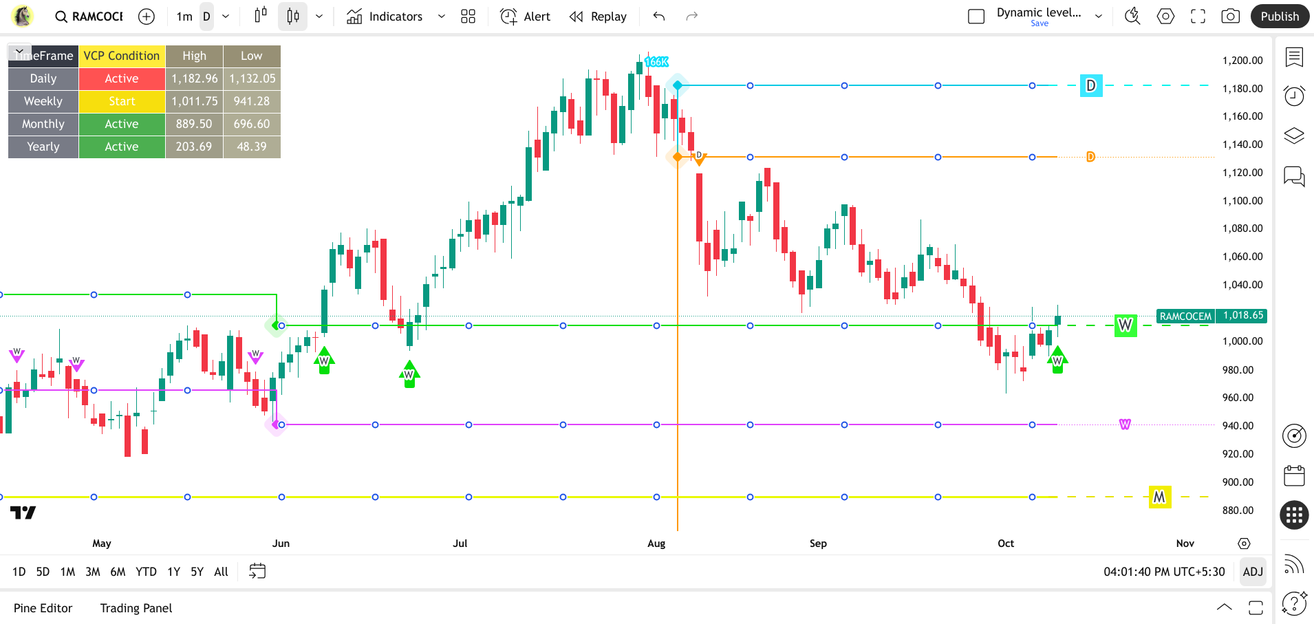
Horse's Eye View: Beyond Human Vision. Where Big Moves Begin.
The Volatility Contraction Pattern (VCP): A High-Probability Setup As Mark Minervini, a renowned trading champion, emphasizes, the Volatility Contraction Pattern (VCP) stands out as a high-probability setup, particularly in strong market conditions. Studies consistently show that 60-70% of VCP breakouts lead to significant price rallies, especially when they occur on robust volume. This impressive success rate makes the VCP a favored strategy among traders.
This powerful VCP algorithmic engine is designed to help traders capitalize on the potential energy buildup that occurs during Volume Contraction Patterns. By monitoring daily, weekly, and monthly VCP simultaneously, it offers an in-depth view of potential breakout opportunities. Here's a detailed look at its features and benefits:
At its core, the indicator employs a sophisticated algorithm to parse VCP price action across daily, weekly, and monthly timeframes. It programmatically detects valid Volume Contraction Pattern (VCP) formations by identifying sequential lower highs and higher lows, calibrated against relevant look-back periods. This unique multi-timeframe VCP validation mechanism is critical for generating robust trade signals and is likely part of a larger trading strategy.
Visual Aids and Dashboard:
- VCP Lines: The indicator plots the calculated VCP across daily, weekly, and monthly VCP high and low levels as lines directly on the chart, making it easy to visualize potential breakout zones. Users can customize the line style and labels.
- Real-time Breakout Detection: The script continuously monitors price action and, on breakout, shows an arrow with the label of the timeframe where the breakout occurred.
- Informative Dashboard: A table is displayed on the chart, providing a quick overview of the VCP status for each timeframe. It shows whether a VCP is "Active," "Inactive," or has just "Started" (meaning the VCP pattern has been detected and the trend is ongoing). "Increase TF" symbolizes that the VCP cannot be fetched. Change to a higher timeframe to know the exact status. The table also displays the VCP pivot high and low values.
Alerting System:
- Customizable Alerts: The indicator offers a highly customizable alerting system. Traders can choose to receive alerts for:
- Breakouts on individual timeframes (e.g., only daily breakouts).
- Convergence breakouts (e.g., daily/weekly convergence).
- Convergence Alerts: A key advantage of this scanner is its ability to detect convergence. This occurs when breakouts happen on multiple timeframes concurrently (e.g., a buy breakout on both the daily and weekly charts). Convergence signals a potentially stronger move as multiple timeframes align.
Note 1 : "It's important to use alerts correctly." Please refer to this YouTube video to understand the concept of creating alerts.
Note 2 : "We strongly recommend enabling alerts on your Watchlist to take full advantage of its features."
Recommended Timeframes for VCP Breakout Detection Alert
While our indicator works across all timeframes, we stongly recommend using the "D" day timeframe. For alert activation, use the following lower timeframes to capture breakouts on their respective timeframes:
- Daily Breakouts: 1-minute timeframe
- Weekly Breakouts: 5-10 minute timeframe
- Monthly & Converging Breakouts: 15-30 minute timeframe
Important Note: Due to the nature of price action on very short timeframes, some VCPs may not be readily apparent, which could impact alert triggering. Therefore, the above timeframes are specifically recommended for reliable VCP breakout alerts.
Benefits for Traders:
- Swing Traders: Early Entry: Swing traders aim to capture quick profits. The VCP helps them enter a trade early in a breakout, right as the stock is starting its upward move. This allows them to ride the momentum and maximize potential gains before the move fizzles out. They get in closer to the "bottom" of the move. A breakout from a VCP on a higher timeframe (e.g., daily or weekly) can signal a multi-day move.
- Positional Traders: Positional traders look for stocks with strong underlying momentum that are likely to continue their upward trend. The VCP often forms within these uptrends, signaling a temporary pause before the next leg up. This increases the odds of the trade working out. It shows the stock is "resting" before another potential move up.
- Trend Traders: Trend trading strategies often leverage a multi-timeframe approach. Identifying the trend is crucial in trading. Successful trading often hinges on capturing the prevailing trend. This is typically achieved by analyzing higher timeframes to identify the overall direction and then employing lower timeframes to pinpoint optimal entry and exit points.
What truly sets the VCP apart is its multi-timeframe diagnostic capability. By pinpointing "Active" volatility contraction across Daily, Weekly, and Monthly scales, the indicator provides a comprehensive view of institutional activity. This simultaneous signal across different time horizons gives traders profound conviction, revealing that underlying strength and demand are consistently eclipsing supply, a critical confirmation magnified by validating volume on a breakout.
Release Notes
Mar 16 2025
Enhanced Signal Versatility: The hierarchical logic allows for a more nuanced approach to VCP detection, catering to different trading styles and risk tolerances.
User-Defined Volume: Allows for adjustable volume thresholds for each timeframe, enabling customization based on specific market conditions and asset characteristics.
New Update includes:
Hierarchical Logic:
- The indicator starts with the most stringent criteria:
- Volatility contraction (defined by decreasing highs and increasing lows).
- Volume exceeding a user-defined threshold.
- All candles within the VCP pattern being bullish (green).
- If the most stringent criteria are not met, the indicator progressively relaxes the conditions:
- First, it checks for VCP with volume exceeding the threshold, regardless of candle color.
- Finally, if that fails, it checks for VCP based on volatility contraction alone.
Configurable Volume Thresholds:
- Users can set separate volume thresholds for daily, weekly, and monthly timeframes through input parameters.
Release Notes
Jun 8 2025
This update includes Turkish language support for the indicator's chart table, enhancing usability for our Turkish-speaking users.
Release Notes
Jun 16 2025
VCP Volume Labels Overhaul: Get precise volume insights with enhanced VCP detection. You can now choose between:
- All Candles: Volume appears on every candle in blue, with VCPs clearly highlighted in yellow at their pivot points.
- VCP Candles Only: For a cleaner chart, volume is shown exclusively on VCP candles. Volumes are automatically formatted (e.g., 1M, 10K) for at-a-glance analysis.
Release Notes
Jul 02 2025
- Broadened Instrument Coverage: Now fully compatible with a diverse range of instruments, including major indices and options charts, offering powerful analytical insights across your portfolio.
- Consistent Accuracy: The core VCP detection logic, including the sophisticated fallback mechanism for data retrieval, has been meticulously applied and refined for Daily, Weekly and Monthly timeframes, ensuring consistent and accurate identification of contraction patterns.
$60 / Lifetime
Rs: 4567
Horse 1513
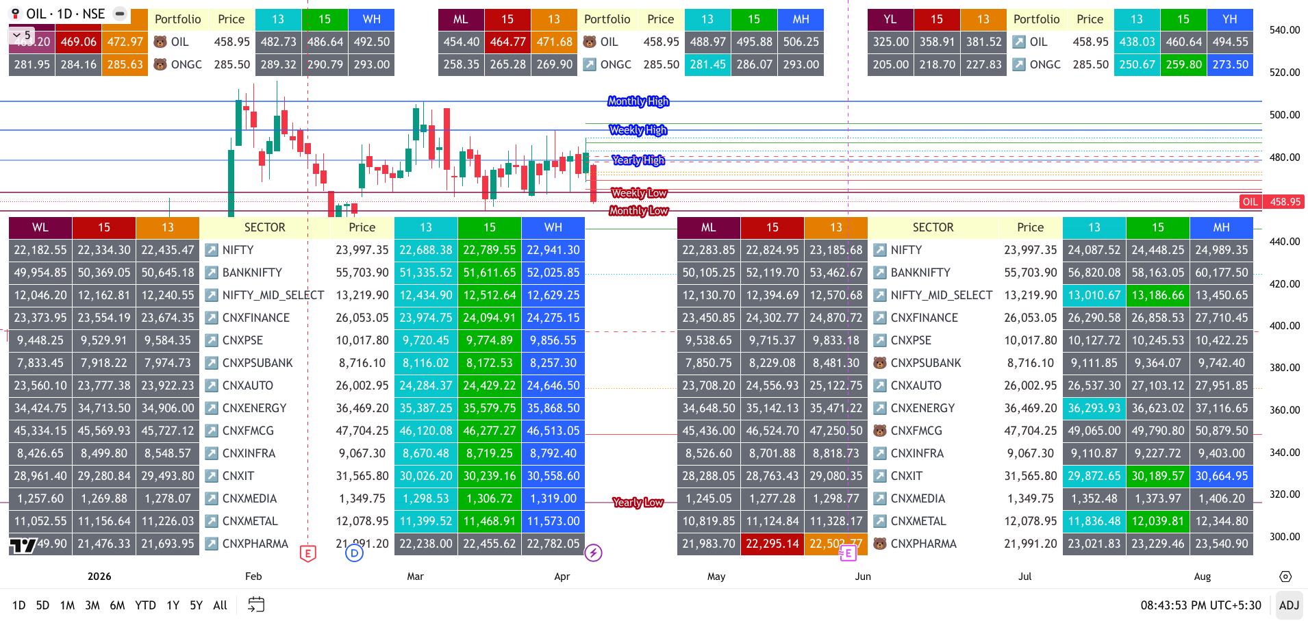
🏗️ The Ultimate Index // Portfolio Multi-Asset Structural Gauge
🚀 Overview: Your Market Command Center
Horse 1513 is not just another indicator—it is a high-speed scanning engine 🛰️ designed to gauge the structural health of the entire market. Instead of getting lost in the noise, this tool allows you to look through an institutional lens to identify exactly where the "Smart Money" is trapping retail liquidity.
By applying the mathematical precision of the 1/5 (Trap), 1/3 (Pivot), and 1/2 (Equilibrium) ratios, Horse 1513 acts as a real-time radar 📡 for the Nifty 50, major Sector Indices, and your own personal Portfolio.
📊 The "Gauge" Capabilities: Scan the Entire Market
Stop clicking through 50 charts! Use the built-in dashboard to monitor the market pulse:
🏎️ Sector Rotation Gauge: Instantly see which sectors are leading (holding above the 1/2 Midpoint) and which are lagging (trapped in the 1/5 Zones).
🔍 Full Index Scanner: One-click scanning for the NIFTY 50, BANKNIFTY, FINNIFTY, and MIDCAP SELECT.
⚡ The Power of Confluence: Multi-Timeframe Alignment
The true "edge" of Horse 1513 is revealed when two or more timeframes align. When your Weekly and Monthly gauges both show a reclaim of the 1/3 Pivot, or when price holds the 1/2 Equilibrium across the Yearly and Monthly charts simultaneously, you have found a high-conviction "Super-Trend." This structural stacking filters out false signals and confirms that the big money is moving in the same direction across all horizons.
💼 My Custom Portfolio: Real-Time Structural Mapping Why watch one chart when you can gauge twenty? This section transforms your watchlist into a live structural heatmap. By mapping your custom assets against Weekly, Monthly, or Yearly ranges, you can instantly see which of your holdings are at the 1/2 Equilibrium and which are primed for a high-probability reversal.
📐 The 1513 Mathematical Framework
The "Gauge" translates price action into three high-probability zones:
1️⃣ The 1/5 Zone (20% - The Trap): 🪤 The "Extreme" zone. When price enters here, it is often a liquidity hunt. (to hit the 1/5 level, where retail "Stop Losses" are usually clustered) This is where Failed Breakouts are born.
2️⃣ The 1/3 Line (33.3% - The Pivot): ⚖️ The "Validation" line. A reclaim of this level confirms the trap is "sprung" and the price is ready to rotate.
3️⃣ The 1/2 Center (50% - The Equilibrium): 🎯 The exact center midpoint. This is the ultimate magnet for rotations and the definitive line in the sand between Bulls and Bears.
💎 Why "Horse 1513" is Your Edge
⚓ Dynamic Timeframe Anchoring: Shift the entire gauge logic between Weekly (W), Monthly (M), or Yearly (12M) boundaries instantly.
🏷️ Smart Dynamic Labels: Professional labels like "Monthly 1/2 Center" update automatically so you never lose your bearings.
🧹 Zero Clutter UI: High-performance Pine Script logic keeps your charts clean while the dashboard stays neatly tucked in your preferred corner.
📈 Mean Reversion Mastery: Identify price action in the 1/5 zone and wait for a 1/3 reclaim for a high-probability move back to the 1/2 Equilibrium.
$60 / Lifetime
Rs: 4567
Horse Trojan Trap
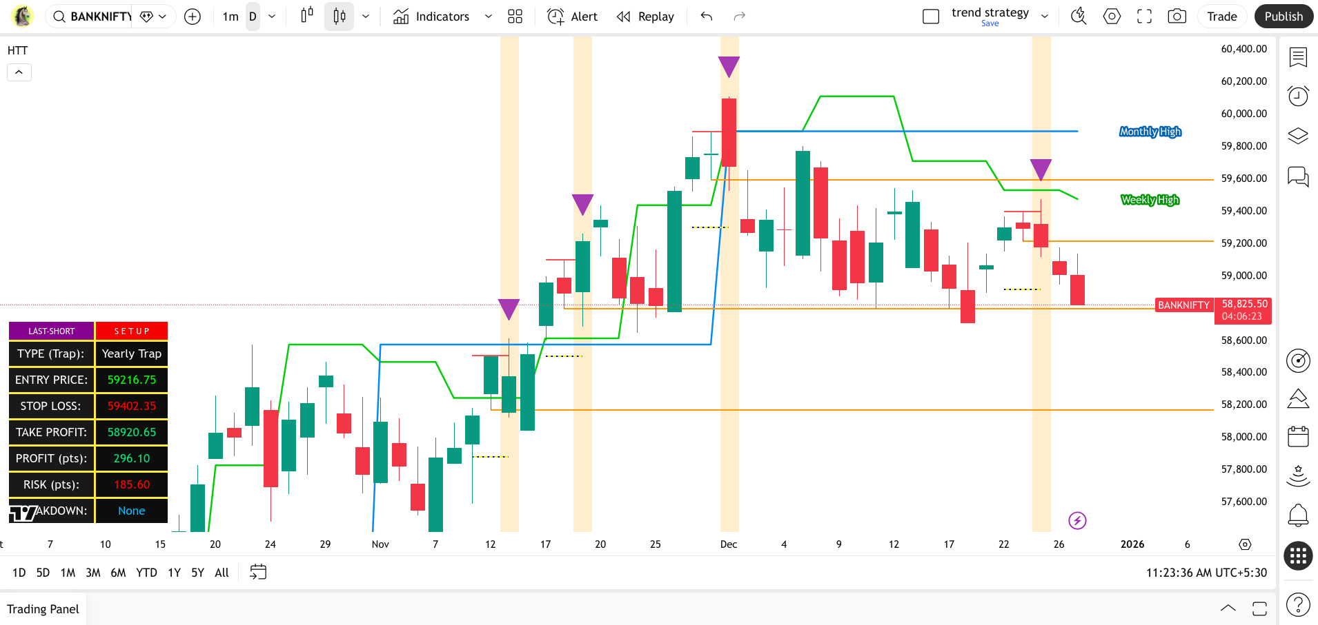
⚓ Hunting [SELL - INTRADAY] setups with Predatory Patience.
🐎 Horse Trojan Trap [HTT] is a high-probability reversal system engineered to exploit tactical deceptions at major structural levels. The logic outlined is a variation of a "Failed Breakout" or "Trap" setup, which is often highly profitable because it captures the moment when breakout traders are trapped, forcing them to liquidate their positions. We enter the market precisely as these forced exits generate a high-velocity momentum wave in our direction.
🏛️ The Legend & The Logic
The term Trojan refers to the famous tactical deception used during the Trojan War. The Greeks built a giant wooden horse, hide soldiers inside, and left it as a "gift." The Trojans pulled it inside their walls, only to be defeated when the soldiers emerged at night.
In the markets, a "Trojan" move looks like a gift—a strong, profitable run—but it is actually a trap.
1. The Wooden Horse (The Bullish Exhaustion)
Your first sign is a series of strong green candles (Min. Green Candles). To most traders, this looks like a "gift"—a massive breakout opportunity. They fear missing out (FOMO) and begin to buy aggressively.
In the code: This is tracked by our Exhaustion Engine.
2. Crossing the Walls (Major Structural Highs)
For the trap to be set, the "Horse" must enter the city. In trading, the "City Walls" are the Weekly, Monthly, or Yearly Highs. When price crosses these gates, buyers feel safe, thinking the resistance is finally broken.
In the code: We use Multi-Timeframe Structural Filters to ensure we are at the gates of the "Major Highs."
3. The Hidden Soldiers (The Reversal Trap)
Once the price is "inside the walls" (above the high), the trap is sprung. The bullish momentum vanishes, and the hidden soldiers (the sellers) emerge. The buyers are caught off guard as the price suddenly reverses, leaving them "trapped" at the highs.
In the code: This is your Short Signal Confirmation, triggered when the "Trojan" momentum fails.
📊 Strategic Features HTT Dashboard:
A real-time command center showing you which "City Gate" has been breached (Weekly, Monthly, or Yearly) and tracking the "Breakdown" progress.
Exhaustion Engine: Configurable settings to define how "powerful" the Horse must be before you look for the trap.
Precision Entry: Automatically identifies the "Trigger Low" where the reversal is confirmed.
Institutional Levels: Integrated Daily, Weekly, Monthly, and Yearly high tracking using precision lookahead logic for historical accuracy.
🛠️ Technical Specifications
🎯 High-Conviction Trigger
To ensure you aren't just "catching a falling knife," the HTT requires specific confirmation before firing a signal. You can toggle between two modes:
First Red Candle Low: The conservative approach. The signal only fires when the low of the first bearish reversal candle is breached.
Next Bar Low (Momentum): The aggressive approach for catching fast-moving liquidity grabs.
⚖️ Dynamic Risk Management
The HTT doesn't just find the entry; it manages the trade. The system automatically calculates:
Automated Stop Loss: Placed dynamically at the recent swing high (the "Apex" of the trap) to protect your capital.
Targeted Take Profit: Calculated based on a user-defined percentage of the entry price, ensuring a mathematical exit strategy.
Visual Levels: The script plots SL and TP rays and Entry Line directly on the chart for instant clarity.
⚡ Timeframe Synergy
The HTT is powered by a universal Multi-Timeframe (MTF) Engine. While it automatically tracks institutional Yearly, Monthly, and Weekly "Gates," it is designed to run on any chart. Whether you are Scalping (1m-5m), Day Trading (15m-1h), or Swing Trading (4h+), the trap logic remains precise—allowing you to catch higher-timeframe institutional moves from your preferred execution timeframe.
🔒 Private Access
This script is part of the Horse Signature Series and is currently available via Private Invite Only.
"The move looks like a winner, but the reversal is already hidden inside."
$60 / Lifetime
Rs: 4567
Horse's DO Candle & Breakout
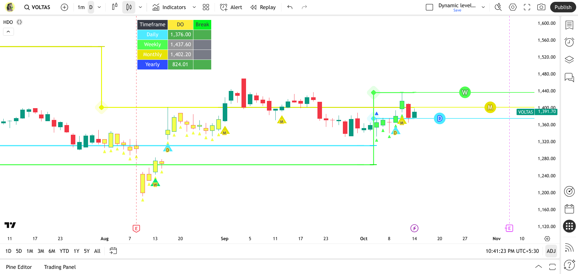
One candle. Total clarity. Find the level where bulls must win (bullish rally).
Just as a fisherman knows where to cast for the best catch after observing the wider ocean, this indicator helps you identify where the market's true power lies, allowing you to position yourself for optimal opportunities rather than chasing fleeting moves.
Introducing the single Horse DO Candle Secret! Forget traditional Support & Resistance. The Horse DO Candle high is the undeniable strong level, acting as dynamic support and resistance that dictates market direction.
Unleash the power of decisive price action with the Horse DO Candle Dashboard, your ultimate tool for identifying and monitoring high-probability breakout opportunities across multiple timeframes. Inspired by the unwavering spirit of "DO" moments in trading, this indicator is designed to help you spot critical junctures where price is poised for a significant move.
What is a "DO Candle"?
A "DO" candle is not a standard technical analysis term in the same way that "Doji" or "Hammer" are. Instead, it's a descriptive, evocative term that our indicator uses to label a very specific and high-stakes scenario.
Imagine a battlefield, and the "DO" candle is the point where the battle for control of the price is at its most intense. It's the moment of ultimate conviction for either the buyers or the sellers.
At its core, this indicator identifies specific algo type bullish candle patterns (what we call "DO") where price has shown strong upward momentum, often marking potential turning points or the initiation of new trends. These are the candles where the market makes a clear statement.
The DO Trend: Build to capitalize on strong bullish momentum.
The DO Indicator gives you a massive strategic advantage by cutting through short-term fluctuations to monitor the most critical weekly and monthly timeframes—all from the simplicity of your daily chart. This is a high-end strategy that empowers you to anticipate major shifts with precision.
This is the core insight that defines the strategy
It has been observed that the trend's final push consistently ends at the high of this specific DO 🔥 candle.
Core Signals for a Strategic Edge
- 🔥 The "DO" Candle: The fire 🔥 symbol marks the formation event of a DO candle. Its appearance on the chart often indicates that the current trend should probaly end at the high.
- ⚪ The High-Level Breakout: A circle ⚪ symbol then appears when the price breaks above the DO candle's high, confirming a key breakout.
Your View of the Bigger Picture
The indicator tracks these critical candles across multiple timeframes, providing a unique dimension of analysis not visible on standard charts:
- Weekly Candle (Green): A weekly candle displayed on the daily chart. This signal's influence typically lasts for 3 to 8 days, giving you a powerful, medium-term outlook.
- Monthly Candle (Yellow): A monthly candle displayed on the daily chart. This is the ultimate "bigger picture" signal, with its influence lasting from 5 to 30 days.
This unique insight into long-term market behavior empowers you to see what other traders miss.
DO Candle Dashboard
Part of the "Horse" suite of indicators, this tool embodies the principles of strength, precision, and decisive action. It cuts through market noise, highlighting only the most impactful price movements and the levels that truly matter. Whether you're a swing trader or looking for daily opportunities, this dashboard provides the clarity needed to make confident, informed decisions.
When your chart comes alive with these signals, it's not just plotting data; it's telling you a story about where the market's conviction lies. Each visual cue is a breadcrumb leading you to those pivotal "DO" moments:
Note on Usage: The Daily timeframe is universally recommended for using this indicator, providing robust signals for all types of traders. You may utilize lower timeframes if your strategy demands, but for optimal clarity and performance, your best results will come from consistently using the Daily chart.
Unlock your trading edge. Add the Horse DO Candle Dashboard to your charts today and start identifying those critical "DO" moments!
How the Indicator Works
Here's a breakdown of what the different parts of the code do:
Multi-Timeframe Analysis: Seeing the Bigger Picture
This indicator is quite smart because it doesn't just look at the timeframe you're currently viewing. It uses Pine Script's request.security function to pull data from Daily, Weekly, and Monthly timeframes simultaneously.
Why is this a game-changer? It lets you see if those critical "DO" candle patterns are forming on the higher timeframes, even if your main chart is set to, say, a 1-hour view. This provides crucial context and helps you understand the bigger market picture without constantly switching your chart's timeframe.
Here's how it breaks down:
- Daily (D): The indicator checks for "DO" candles on the daily chart.
- Weekly (W): It also monitors for "DO" candles on the weekly chart.
- Monthly (M): And finally, it scans for "DO" candles on the monthly chart.
By doing this, you can quickly spot strong, high-conviction signals that might be developing on longer timeframes, adding significant weight to potential trading opportunities.
Chart's Whisper, Market's Roar: Visual Cues Decoding the "DO" Story
When your chart comes alive with these signals, it's not just plotting data; it's telling you a story about where the market's conviction lies. Each visual cue is a breadcrumb leading you to those pivotal "DO" moments:
- The "DO" Canvas Transformation: Forget bland candles! When a "DO" setup takes hold on a higher timeframe, the very essence of the bar transforms, screaming its significance through color:
- Daily's Bold Blue (#4deaff): A flash of electric blue tells you the daily fight was won decisively. It's the market's daily declaration of strength.
- Weekly's Resilient Green (#4dff50): Watch for the vibrant green, signaling a week where conviction triumphed over any dips. This isn't just a win; it's a testament to sustained power.
- Monthly's Golden Proclamation (#f3ff4d): A rich golden yellow lights up the monthly bar, marking a long-term battle where the "DO" moment sealed a major shift. This is the big picture, often foretelling significant moves.
- The "Victory" Arrowhead: Just beneath these transformed bars, a tiny, upward-pointing triangle emerges, mirroring the bar's newfound color. Think of it as the market planting its flag – a subtle, yet powerful, testament that the "DO" condition has been met and momentum is on the side of the bulls.
- The "DO" Threshold Lines: Stretching from the high of each "DO" candle, these horizontal lines aren't just levels; they are the market's ultimate conviction thresholds. They hold the same vibrant color as their parent candle, marking the precise boundary where the market's strength will either prevail or falter.
- The "Breakout" Beacon: When the price decisively breaches one of these vital thresholds, a brilliant triangle-up arrow ignites below the bar (light blue for Daily, vivid green for Weekly, warm yellow for Monthly).
Alerts
Intelligent Breakout Attempt Alerts: Never miss a critical moment! Configure alerts to notify you on the N-th breakout attempt of a "DO" level. This means you can choose to be alerted on the first, second, or any subsequent attempt to breach a key level, giving you a strategic edge in confirming true market conviction.
Interactive Dashboard Table
Real-Time Dashboard for Live Action: The integrated, customizable dashboard provides at-a-glance status of each timeframe's "DO" level. Crucially, it uses a lower timeframe's current close to show you in real-time whether price is currently trading above a critical level, even if the higher timeframe bar hasn't closed yet, perfect for active traders!
Color-Coded Status: Your At-a-Glance "DO" Readout
The dashboard cells instantly communicate the status of each timeframe's "DO" level:
- Active "DO": The cell displays the condition's specific color (light blue for Daily, light green for Weekly, light yellow for Monthly) when "Condition 3" is currently true.
- Above Level: If the current bar's close (
LTFClose) is trading above the "DO" level, the cell turns green, indicating a sustained breakout. - Below/Neutral: Otherwise, the cell remains gray.
Dynamic Levels & Labels
Charting the "DO" Thresholds: Beyond the dashboard, the indicator dynamically draws labels ("D," "W," or "M") and lines directly on your chart at the respective Daily, Weekly, and Monthly "DO" high levels. These lines extend into the future, providing clear, persistent visual references for these critical price points over time.
Note on Usage: The Daily timeframe is universally recommended for using this indicator, providing robust signals for all types of traders. You may utilize lower timeframes if your strategy demands, but for optimal clarity and performance, your best results will come from consistently using the Daily chart.
Unlock your trading edge. Add the Horse DO Candle Dashboard to your charts today and start identifying those critical "DO" moments!
A high-probability trading strategy is like a powerful horse: the world's best strategies are useless if you don't know the rules (the reins) for executing them successfully.
$50 / Month
Rs: 3000
$300 / Year
Rs: 25000
Not for Lifetime
Horse’s DIE Candle & Breakdown
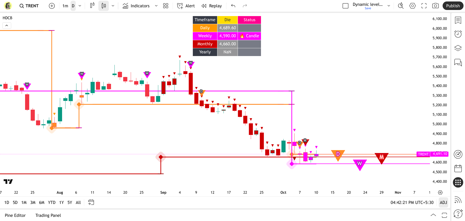
Horse's Die Candle & Breakdown : Bearish Momentum Strategy
One candle. Total conviction. Find the level where bears must win (bearish collapse).
Just as a demolition expert knows the exact stress point to collapse a structure, this indicator helps you pinpoint where the market's true bearish pressure lies. It allows you to position yourself for optimal downside opportunities rather than hoping for a reversal.
The Horse DIE Candle Secret
Introducing the single Horse DIE Candle Secret! Forget traditional Support & Resistance. The Horse DIE Candle low is the undeniable strong level, acting as dynamic resistance and support that dictates market direction.
Unleash the power of decisive price action with the Horse DIE Candle Dashboard, your ultimate tool for identifying and monitoring high-probability breakdown opportunities across multiple timeframes. Inspired by the unwavering spirit of "DIE" moments in trading, this indicator is designed to help you spot critical junctures where price is poised for a significant move down.
What is a "DIE Candle"?
A "DIE" candle is not a standard technical analysis term, but a descriptive, evocative term our indicator uses to label a very specific and high-stakes scenario.
At its core, this indicator identifies specific algo type bearish candle patterns (what we call "DIE") where price has shown strong downward momentum, often marking potential turning points or the initiation of new bearish trends. These are the candles where the market makes a clear statement.
The DIE Trend: Built to capitalize on strong bearish momentum.
Strategy Core and Multi-Timeframe Signals
The core insight is that the trend's final push consistently ends at the low of this specific die 🔥 candle.
Core Signals for a Strategic Edge
- 🔥 The "DIE" Candle: The fire 🔥 symbol marks the formation event of a DIE candle. Its appearance often indicates that the current uptrend should probably terminate at the low.
- ⚫ The Low-Level Breakdown: A circle ⚫ symbol appears when the price breaks below the die candle's low, confirming a key breakdown.
Your View of the Bigger Picture (MTF Analysis)
The indicator tracks these critical candles across four timeframes:
- Weekly Candle (Magenta): Influence typically lasts 3 to 8 days, providing a strong medium-term outlook.
- Monthly Candle (Red): Influence typically lasts 5 to 30 days, providing the foundational long-term signal.
- Yearly Candle (Dark Blue): Displayed on the daily chart, this signal is the most long-term, with its influence lasting for months, indicating the market's absolute primary trend.
The DIE Candle Dashboard
How the Indicator Works (MTF Analysis)
This indicator uses Pine Script's request.security function to pull data from Daily, Weekly, Monthly, and Yearly timeframes simultaneously.
- Daily (D): Checks for bearish "DIE" candles on the daily chart.
- Weekly (W): Monitors for bearish "DIE" candles on the weekly chart.
- Monthly (M): Scans for bearish "DIE" candles on the monthly chart.
- Yearly (Y): Scans for bearish "DIE" candles on the yearly chart.
Visual Cues: Decoding the "DIE" Story
The "DIE" Canvas Transformation: When a bearish "DIE" setup takes hold on a higher timeframe, the bar's color transforms:
- Daily's Bold orange (#CC0000): Daily fight won decisively by the bears.
- Weekly's Striking Fuscia (#FF00FF): Sustained downside pressure for the week.
- Monthly's Maroon (#000000): A major long-term shift sealed by the "DIE" moment.
- Yearly's Black (#00008B): New! Primary trend defined by the largest time frame.
- The "Conviction" Arrowhead: A tiny, downward-pointing triangle emerges beneath the transformed bar, confirming that bearish momentum is in control.
- The "DIE" Threshold Lines: Horizontal lines extending from the low of each "DIE" candle, marking the precise boundary where market weakness will either prevail or stabilize.
- The "Breakdown" Beacon: A brilliant triangle-down arrow ignites above the bar when the price decisively breaches one of these vital thresholds (Red for Daily, Magenta for Weekly, Black for Monthly, Dark Blue for Yearly).
Alerts
Intelligent Breakdown Attempt Alerts: Configure alerts to notify you on the N-th breakdown attempt of a "DIE" low level, giving you a strategic edge in confirming true market conviction for a drop.
Interactive Dashboard Table
The integrated dashboard gives an at-a-glance status of each timeframe's "DIE" level. It uses a lower timeframe's current close to show you whether price is currently trading below a critical level in real-time.
- Active "DIE": The cell displays the condition's specific color (Red, Magenta, Black, Dark Blue).
- Below Level: If the current bar's close (LTFClose) is trading below the "DIE" level, the cell turns Red, indicating a sustained breakdown.
- Above/Neutral: Otherwise, the cell remains gray.
Usage Note: The Daily timeframe is universally recommended for using this indicator, providing robust signals for all types of traders.
Unlock your trading edge. Add the Horse's Die Candle & Breakdown dashboard to your charts today and start identifying those critical bearish "DIE" moments!
$50 / Month
Rs: 3000
$300 / Year
Rs: 25000
Not for Lifetime
Horse's DO Candle & Breakout + VCP SCAN
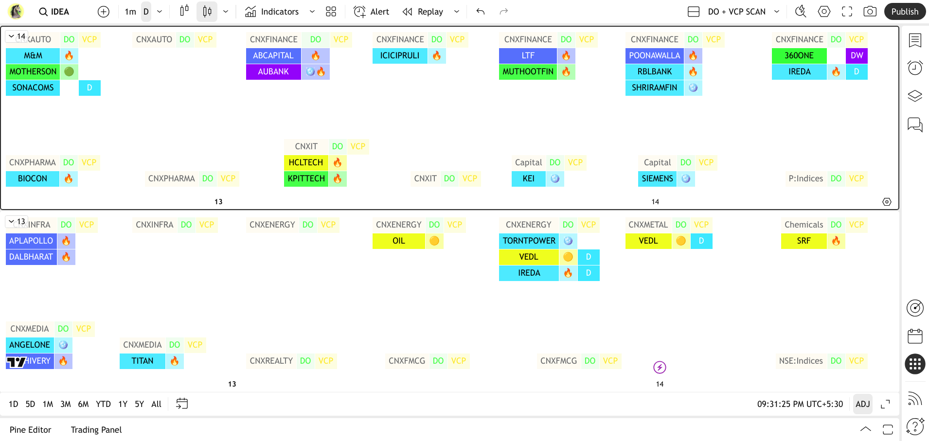
Spotting Stocks, Often Before the News Breaks.
SCAN Turkish (600 Symbols )
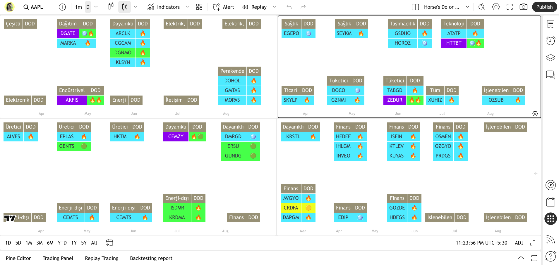
SCAN Crypto (100 Symbols )
The Horse DO Screener is a sophisticated tool designed to revolutionize how you identify high-conviction trading opportunities. Going beyond simple price alerts, this screener leverages the proprietary "DO" candle logic to scan the entire market and visually present stocks that are at critical junctures.
🔥 'Fire' symbol indicates a significant candle forming on a higher timeframe. And the trend probably must end at the highest in upcoming days. (greenlime & yellow Color candles)
⚪ 'circle' indicates the candle high is broken out. Emergence of new trend start.
What it Does:
- Intelligent Pattern Recognition & Multi-Timeframe Scanning: At its core, the screener automatically identifies the unique "DO" candle pattern across a vast universe of stocks, operating simultaneously across crucial timeframes: Daily (D), Weekly (W), and Monthly (M). This powerful combination allows you to quickly pinpoint moments of ultimate market conviction and filter for setups that align with significant longer-term dynamics, empowering you to confirm strategic entry or exit points with higher confidence.
- Visual, Timeline-Based Insights: As seen in the image, the screener presents these findings in an intuitive, timeline-oriented display. This visual organization allows you to effortlessly track when and where "DO" conditions have been met, providing a historical context and immediate insights into current market shifts across different sectors (e.g., Banking, Finance, Pharmaceuticals, etc.).
- Pinpointing True Market Power: Just as a skilled fisherman knows where to cast for the best catch after observing the wider ocean, this screener helps you pinpoint critical junctures where price has shown a moment of ultimate conviction, signaling potential high-probability opportunities for strategic market positioning. It's your ultimate filter for finding where the market's true power lies.
The DO Scanner: See Where Momentum Ignites. HIGH-PROBABILITY SETUPS.
$100 / Month
Rs: 9000
$1000 / Year
Rs: 90000
Not for Lifetime
Horse's DIE Candle & Breakout + VCP SCAN
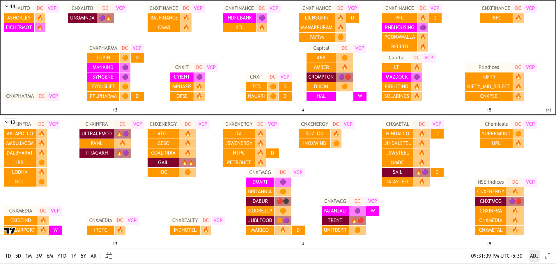
Spotting Stocks, Often Before the News Breaks.
SCAN Turkish (600 Symbols )
SCAN Crypto (100 Symbols )
The Horse DO Screener is a sophisticated tool designed to revolutionize how you identify high-conviction trading opportunities. Going beyond simple price alerts, this screener leverages the proprietary "DO" candle logic to scan the entire market and visually present stocks that are at critical junctures.
🔥 'Fire' symbol indicates a significant candle forming on a higher timeframe. And the trend probably must end at the highest in upcoming days. (greenlime & yellow Color candles)
⚪ 'circle' indicates the candle high is broken out. Emergence of new trend start.
What it Does:
- Intelligent Pattern Recognition & Multi-Timeframe Scanning: At its core, the screener automatically identifies the unique "DO" candle pattern across a vast universe of stocks, operating simultaneously across crucial timeframes: Daily (D), Weekly (W), and Monthly (M). This powerful combination allows you to quickly pinpoint moments of ultimate market conviction and filter for setups that align with significant longer-term dynamics, empowering you to confirm strategic entry or exit points with higher confidence.
- Visual, Timeline-Based Insights: As seen in the image, the screener presents these findings in an intuitive, timeline-oriented display. This visual organization allows you to effortlessly track when and where "DO" conditions have been met, providing a historical context and immediate insights into current market shifts across different sectors (e.g., Banking, Finance, Pharmaceuticals, etc.).
- Pinpointing True Market Power: Just as a skilled fisherman knows where to cast for the best catch after observing the wider ocean, this screener helps you pinpoint critical junctures where price has shown a moment of ultimate conviction, signaling potential high-probability opportunities for strategic market positioning. It's your ultimate filter for finding where the market's true power lies.
The DO Scanner: See Where Momentum Ignites. HIGH-PROBABILITY SETUPS.
$100 / Month
Rs: 9000
$1000 / Year
Rs: 90000
Not for Lifetime
Horse's U-TURN
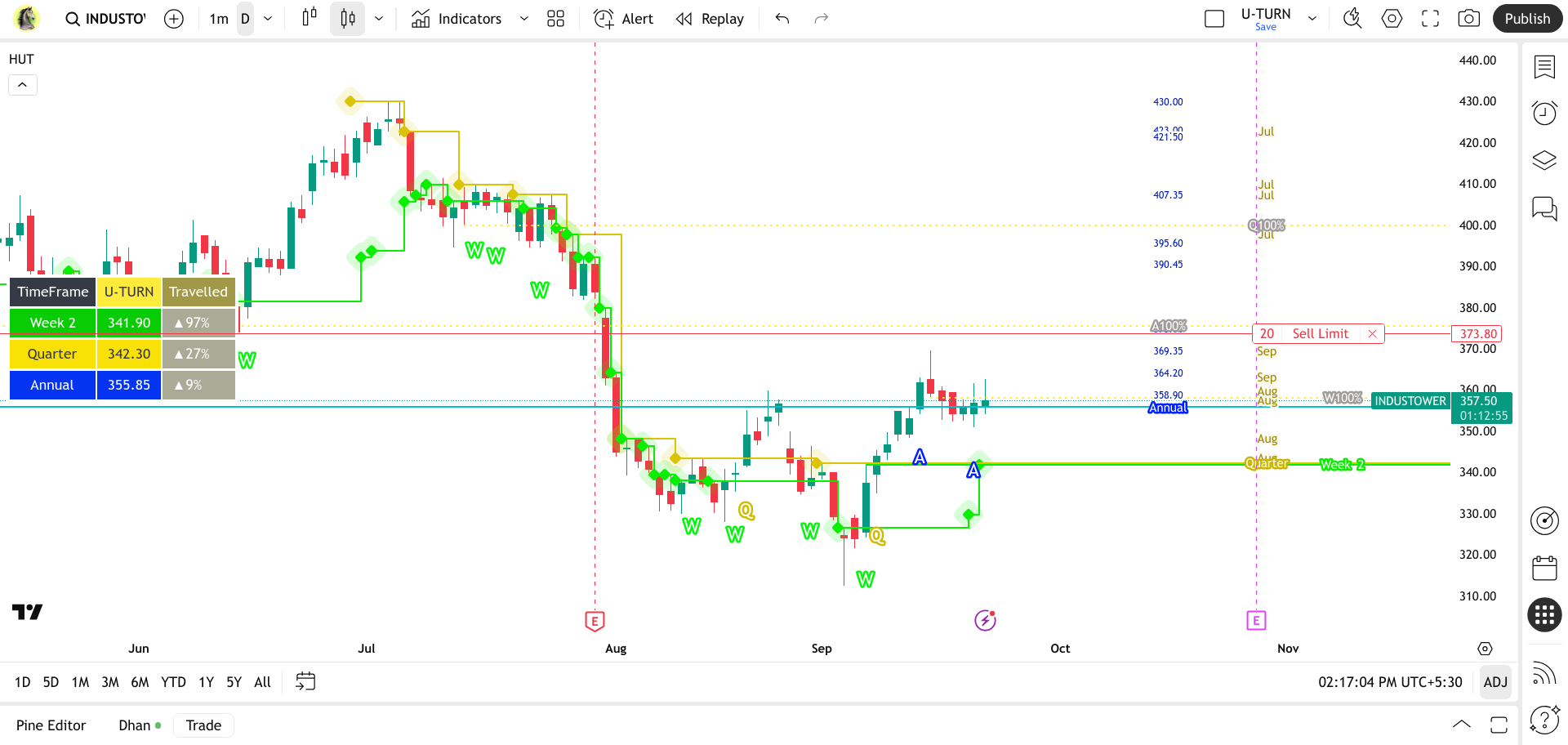
HIGH-PROBABILITY SETUPS.
KNOW exact where the market can give you the PROFIT
Trading is a war. The Horses U-TURN (HUT) is your command center.
This powerful dashboard cuts through the noise to show you exactly where the battle is being fought. It instantly highlights key support and resistance levels across the monthly, weekly, and daily timeframes, giving you a clear, consolidated view of the market's most critical junctures. By focusing on recent turning points—the "High Bottoms" and "Low Tops"—it gives you the ultimate edge in identifying high-probability breakouts and reversals before they happen.
The daily time frame is recommended because it provides a clearer picture of market trends, allowing you to plan your strategy more effectively. Remember, even the highest-probability strategy will fail if not executed properly. This approach is best for BTST (Buy Today, Sell Tomorrow) and swing traders.
When the indicator reaches 100%, a drop reversal is highly probable.
But don't trade blind! 🚨 Use the "DO" indicator to confirm the true trend and identify optimal hold points based on its unique 🔥Glowing Candle and 🟢Breakout signals.
The Horse's U-TURN (HUT) Indicator
The Horse's U-TURN (HUT) indicator is a sophisticated, proprietary analytical system engineered to pinpoint high-probability trend accelerations by focusing exclusively on major structural breaks.
HUT's unique power lies in its calculation of U-TURN Levels, which are defined as the Lowest High of the last Nth periods (High Bottom) simultaneously tracked across the Daily, Weekly, and Monthly timeframes. This specific historical swing low acts as a proven, robust ceiling of resistance. When the price breaks and closes above this critical ceiling, HUT instantly generates a clear, prioritized signal (W, Q, A, or the ultimate WQA confirmation) signifying that the market is executing a definitive "U-TURN" into a major new bullish trend. HUT helps traders ignore minor noise and focus only on the most structurally significant shifts.
This layered approach allows traders to filter out noise and only focus on high-probability setups that have momentum confirmation across different market perspectives.
How Traders Benefit from the HUT Indicator
The Horse's U-TURN (HUT) provides the clarity and conviction needed to capitalize on significant market moves.
The color-coded labels on the chart (like the powerful Blue WQA signal) provide instant visual cues for strong buying opportunities where resistance has been cleared across multiple timeframes. This helps traders enter positions early in a developing trend with confidence.
The indicator includes a compact, real-time dashboard displaying the exact value of the current U-TURN Level for each timeframe. Crucially, the dashboard tracks "Travelled Percentage" toward the next major level, indicating how close the price is to hitting 100% of its range (High-Bottom to Low-Top), which can be used for profit-taking or identifying exhaustion.
The plotted U-TURN lines themselves can be used as dynamic support levels. Once a U-TURN is confirmed, the previous resistance level often transforms into a strong floor, providing ideal locations for setting stop-loss orders.
By optionally plotting all historical swing highs across each timeframe, traders can visualize a ladder of historical resistance levels (Show Targets option), allowing for granular profit-taking strategies and scaling out of positions.
Key Features
- Advanced U-TURN Logic: Uses the Nth-bar Lowest High (High-Bottom) for robust resistance detection.
- Triple Timeframe Confirmation: Simultaneous tracking of Daily (W), Weekly (Q), and Monthly (A) U-TURNs.
- Concise Signal Labels: Clear labels (W, Q, A, WQ, WQA) plotted directly on the chart for instant identification.
- Dynamic Dashboard: Real-time data including exact level values and Travelled Percentage to gauge momentum and proximity to range limits.
- Multi-Language Support: Includes English and Turkish text options.
$25 / Month
Rs: 2000
$240 / Year
Rs: 21000
$600 / Lifetime
Rs: 53000
Horse's U-TURN SCAN
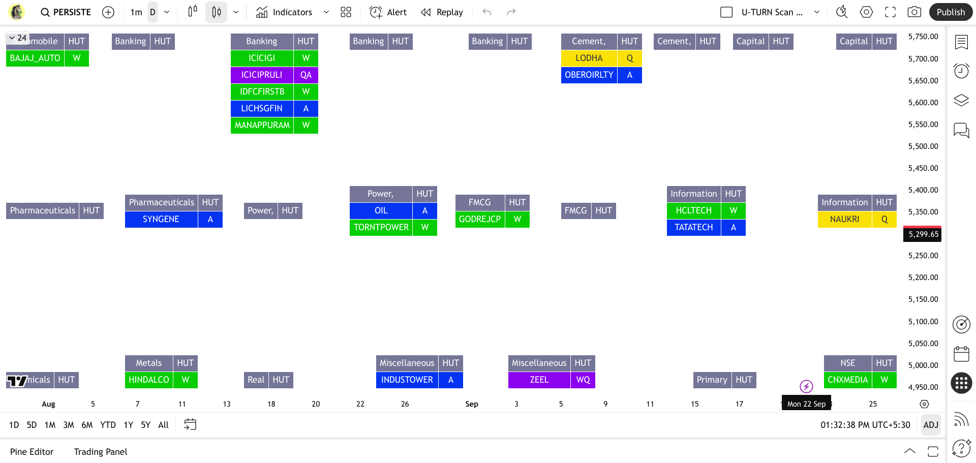
Catch the U-TURN
USE with, DO, to know the momentum & trend direction. KNOW exact where the market can give you the PROFIT
$15 / Month
Rs: 1000
$120 / Year
Rs: 11000
$300 / Lifetime
Rs: 25000
About Me:
My Own Foundation
I don't care what they think of me, as they were never there when I was fighting battles in silence. They didn't see the nights I stayed awake. The mornings I got up broken, but still moving.
They judge from the outside, but they'll never feel what I've endured inside.
I no longer live for approval, applause, or validation. I live for growth, for peace, and for purpose. I was born to stand out.
Their opinions are noise. Their doubts are fuel. Their silence is freedom.
I'm not cold. I'm focused. I'm not arrogant. I'm aware.
I've built myself through storms they will never survive.
When you stop caring about what people think, you unlock the life meant for you.
I am not just building indicators; I am crafting intelligent trading solutions. Get ready to experience the next evolution in market analysis – more breakthroughs are on the horizon!
Do Like, Share & Subscribe
To my Youtube Channel To get new upcoming videos to your Inbox.
"My commitment is to prioritize ongoing indicator development, ensuring traders have access to the most effective tools."
We believe in empowering traders, not providing misleading signals. While many platforms promise instant profits with simple "buy" and "sell" signals, we take a different approach. Our indicators and tools provide a clear picture of the market, backed by proper statistical analysis and data-driven insights. This ensures you're looking at a transparent and factual view of the charts, giving you the confidence to make your own informed decisions based on solid analysis, not on unverified promises.
I believe that a great trading strategy is forged through a process of elimination.
"After developing and discarding over 900 custom-built indicators and scanners, I uncovered a handful of truly unique, high-probability strategies—designed from the ground up to do what most tools can't: deliver real, consistent profits. These are not repackaged indicators—they're original systems, battle-tested in live markets, and built to give traders a real edge."
No fluff. No gimmicks. Just high-probability setups designed to dominate the market and deliver real profits.
How to Set Up Alerts with Horse Volume Pivot
How to Set UP DO Scanner
Rule #1: You can’t become RICH without learning to Invest.
💰 “No investment. No wealth.”
Payment Options (India)
For UPI (India)
- 9867408528@pthdfc
- rishikesh579@okhdfcbank
Scan below QR Codes to Pay (India)


Payment Options (International)
For PayPal
RISHIKESH579@gmail.com
For Binance
1142030540
For Westernunion / Only bank transfer Accepted
Contact Me for details
After payment, Please WhatsApp me your payment screenshot and share your TradingView username.
So I can grant you access.
Happy trading!
Rare Opportunity: The Entire "Horse Trading Indicators" Brand is For Sale!
After years of dedicated development and serving the TradingView community, I've decided to explore new ventures. This is a unique opportunity to acquire a complete, proven brand of Pine Script indicators.
Asking Price: ₹99 Lakhs / 113000 $
If you're an individual or entity looking to own a recognized and performing suite of trading tools, I invite you to get in touch for a confidential discussion.
For serious inquiries, please contact me directly at: rishikesh579@gmail.com